Concept Art: Sam
Chapter: Comics, Season Five
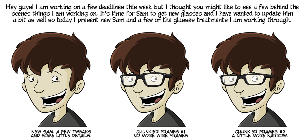
Like the comic says, I am working through a few deadlines this week and getting the next arc ready so this week I am posting a bit of concept art to hold everyone over. Sam has been an ongoing process for me since day one and I while this version only has a few tweaks, I really like him. Now, I am working through different glasses options to see which one I like the best.


Hover-Text: Some folks suffering from ClarkKentitis will not be able to recognize Sam without glasses. Bless your hearts, I promise that really is Sam.
Aw… I really liked Sam’s glasses. They looked a lot like mine.
We’ll also need to see Elton John, Dame Edna, and Cyclops treatments.
He should be gordon freeman for halloween…just sayin.
interesting … i like the third one the best.
though, it looks to me like he could use a haircut…
#somanyoptions
I love #3! Works very well with how you draw his face and hair. *re-enters lurk status*
I like #3 best. It looks a little more grown-up, and seems to go with how he’s been developing.
#2
Frame option 2 definitely looks the best. Not as in your face as option three, and distinctive enough to still give that nerdy air that is fitting to Sam.
Ok let me correct myself. I looked back and saw my own stupidity there.
“Frame option 2 definitely looks the best. Not as in your face as option ONE, and distinctive enough to still give that nerdy air that is fitting to Sam.”
I’m kind of digging the third Sam.
The third one is David Tennant, as the Doctor.
I’m leaning towards “Clunkier Frames #2” myself
Frames #2 is my vote.
Shame to see yet another break. Can’t remember last time we had three comics in the same week.
Yep. I already feel bad enough about it but I have to pay the bills.
Ultimately, you know your character better than any of us. Personally, I like the narrower of the chunkier frames.
Is it just me, or does Sam look less excited in the far right compared to the other versions? His eyebrows aren’t as high. The middle Sam looks like he’s excited to see someone walk through the door. The Sam on the right looks like he’s being casually pleasant.
You are correct, sir. If you look at the hair point that his right-side eyebrow crosses, the brow line is closer to the bottom in the third drawing than in the other two. It’s amazing how much emotion we can read out of one little pair of lines, isn’t it?
That out of the way, I also like the smaller frames. They fit the shape of his face better. (I find the middle image frames a little overpowering for him.)
Damn, you’re a good artist these days, Brian!
I’ll miss the wire frames, but I think the narrower of the two chunkier frames definitely looks better on him.
I wouldn’t mind if Sam alternated some arcs with/without glasses. I don’t always wear mine (but I’m also nearsighted). Also, I like the second glasses option (narrower) better. Take it from someone who has Trevor as his spirit animal.
Oh gurl.
Option #3 makes his whole head look smaller not just his glasses and I like that. Though I think he needs a new haircut to go along with it if he goes with that one.
Give him some of those WildEyez contacts 😉
#3 is far superior. They are the ones that Amy would help him pick out.
They look great! Except they look way too close to Trevor :/
I find it eerie how hes staring at his other selves like that.
Did you tweak his hair color as well? Perhaps it is just a lighting thing in my office, but the one on the right seems like it has a lighter color in the highlighted area.
So wait, the first pic, you are introducing a new character also named Sam? 😉